

Interprets your Intentions…
Graphic Design is more than the sum of its parts. What I mean by that is, it can sometimes be perceived as child’s play - but it’s actually not. With the introduction of digital tools that anyone can access, and the widely available AI algorithms that can do the designing for you, graphic design is often presented as a commodity to buy rather than a skillset to hire. This cannot be farther from the truth.
Even if I had access to all the tools and the parts necessary at my local auto parts store, I would never try to replace the water pump in my car. Because without the right experience in automobile repair, I might not see a bigger problem with the engine, or I might miss an important step when putting it all back together. This would put my safety at risk and might cause a more expensive problem down the road.


See the forest through the trees…
So, just like a good mechanic, an experienced graphic designer will properly evaluate and advise by asking the right questions as well as providing good design. When starting a new project, I think it’s important to find out where the design will to be used as much as the desired style and presentation of the elements. If a graphic designer works in the industry long enough, he or she will develop a unique style that they may be known for, but an experienced designer will have the ability to work in many different styles to provide the right design solution for a client.
I started my journey in graphic design at a young age, high school to be exact. Throughout my long career, I learned the art of visual communication through graphic elements and color treatments as well as words and phrases. And now over 40 years later, I’m still learning new techniques and principles every day.


The Logo.
In a design project, the logo is where a lot of inspiration comes from. There are many opinions out there about how a logo should look and there are many designers who design with a certain style that they may be known for.
What I have found in my experience is that the less complex that a logo is, the more memorable and “sticky” it becomes to the viewer. My approach to designing logos has been to consider not only the style but the functionality as well. When it comes to logo design, I believe you have to listen to the client, ask the right questions, and try to find out what their true passion and conviction really is. Below are some examples of logo design work where I try to illustrate this concept.


Sometimes it is the shape of a design element that is the most compelling part of a logo. In this instance, the circles represent the business end of an endoscope without being obvious. The Helvetica Neue Thin font reinforces the precise nature of the medical specialty the Center provides.


The idea behind the shapes comes from the tagline. Using color to differentiate the foundation from the family (or community), the black figure positioned slightly above and to the right helps to visualize the foundation's commitment to the community.
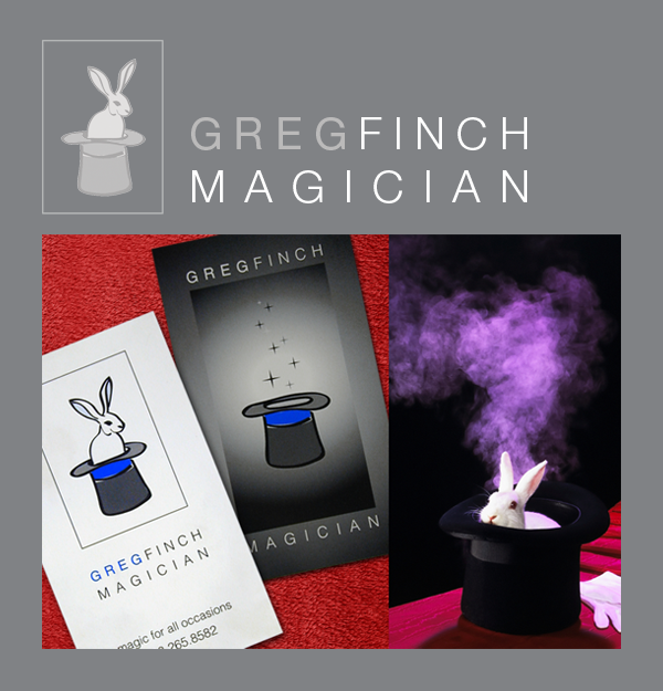

Greg was a police officer
by day and a magician
by night…
He had no concept of what kind of logo he wanted, just "not ordinary" was his requirement as I recall. I asked if he used a rabbit in his show… he said of course. So, using both sides of the card, one side in white and the other in black - allowed for the negative and positive spaces to highlight the design, as well as pay tribute to the iconic trick.


As a fund management company this client focuses on overall retirement strategies. They wanted the logo to portray a sense of security and calm. The sailboat is quite effective at giving the viewer a sense of stability, financial independence and personal fulfillment.


The client's original logo was just the "branding iron" styled initials in the center of the icon. I updated the design by enclosing the shape in a medallion. The use of Optima font in the name gave it the upscale & professional feel that they we're looking for.


The client chose this version in a series of comping rounds that encompassed a wide variety of styles for their corporate brand. Being a manufacturer of solar powered products, the tagline had to be incorporated into the design and the whole logo had to be scalable for multiple applications including parts fabrication. The three crescent shapes in the logo are meant to evoke using the sun’s energy.


Dr. Fong wanted a non-traditional logo for his new office. The challenge was to find a style that was playful and fun yet would work for a family dental practice. Converting the letter "N" in his name to a tooth shape helps to tie it all together visually. He wanted a bright and fun color palette which was how we arrived at the multi-color design.


During the process of creating this logo I did a bit of word association. The word "Wise" eventually lead me to the sunrise image. The rising sun is a constant - so the idea is meant to imply consistancy in the firms knowledge and advice.


In opening her new salon, the client decided early on that she did not want convention in the name or the look of the collateral, so she played with the notion of a tune up garage for hair. Ultimately she decided that a literal automotive garage theme might scare off the more conservative clientele. The solution was to use “Mechanics” in the name only, with a fun and playful font to create a more versatile logo that is unique.


The management at iVina wanted to create a logo that would distinguish the corporate office from the developers who designed the BookScan Station’s Hardware and Software. So, in designing the logo, I opted for highlighting the clarity of their scanning software by using the “Halftone” effect on the letter A in the name. The arc between the V and N represent the ease of use of the product.